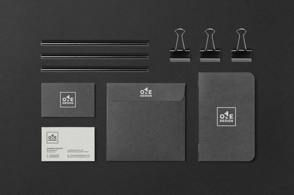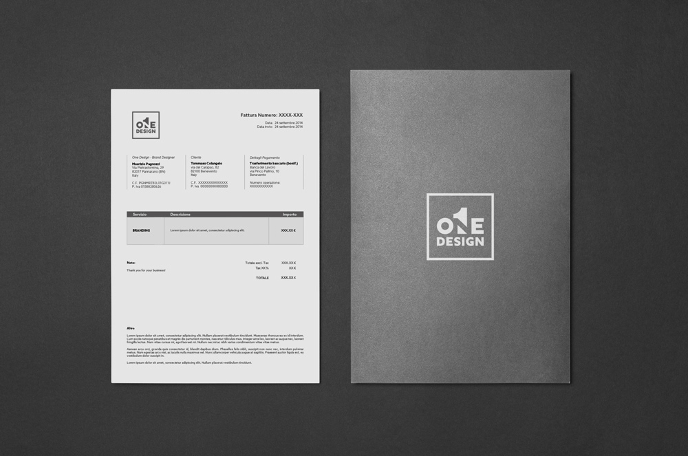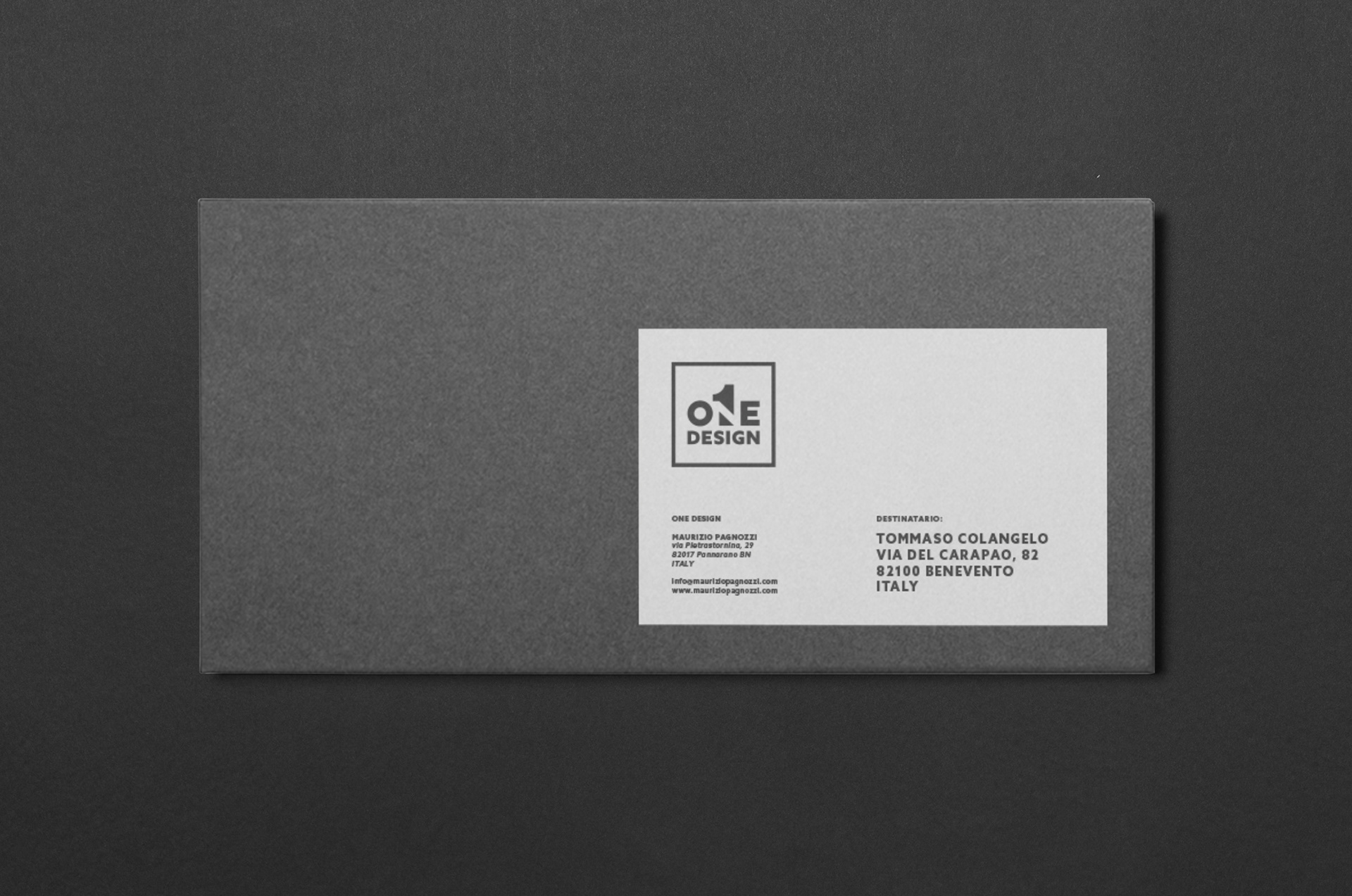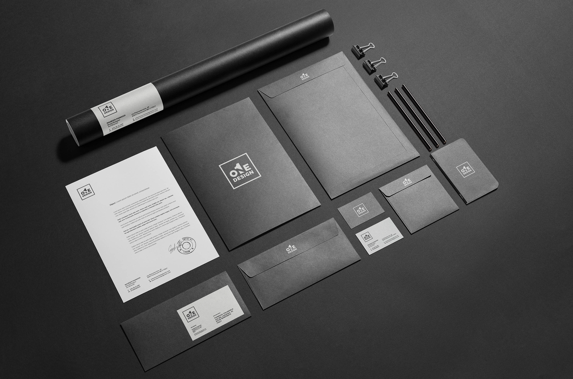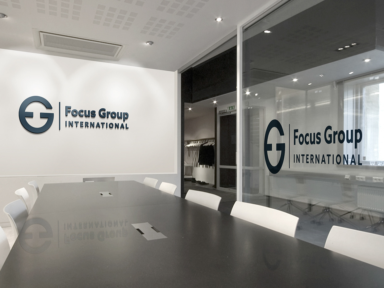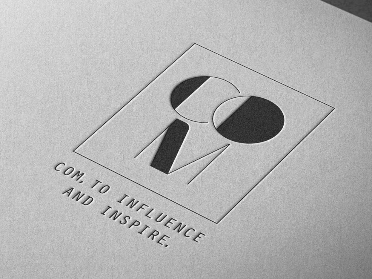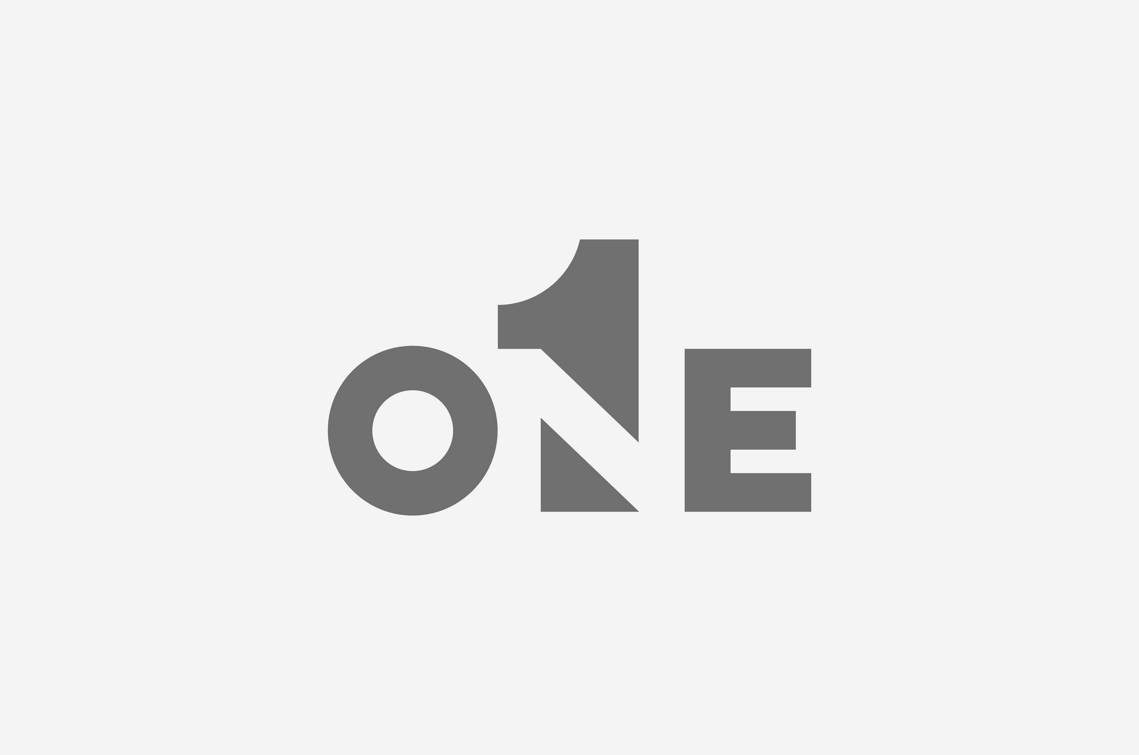
A personal identity is not just a visual signature, but a statement of method.
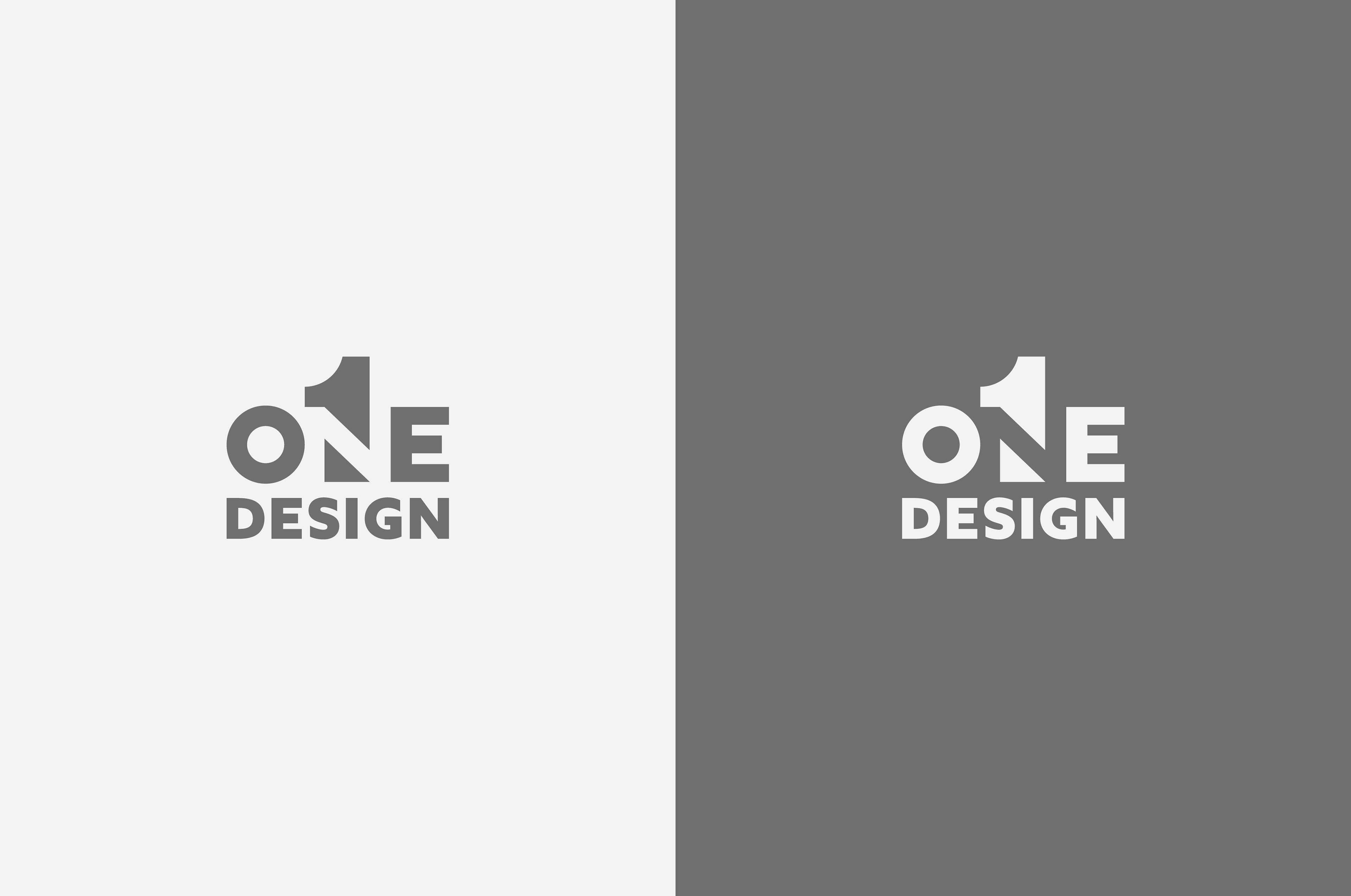
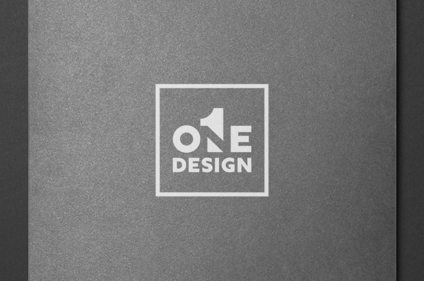
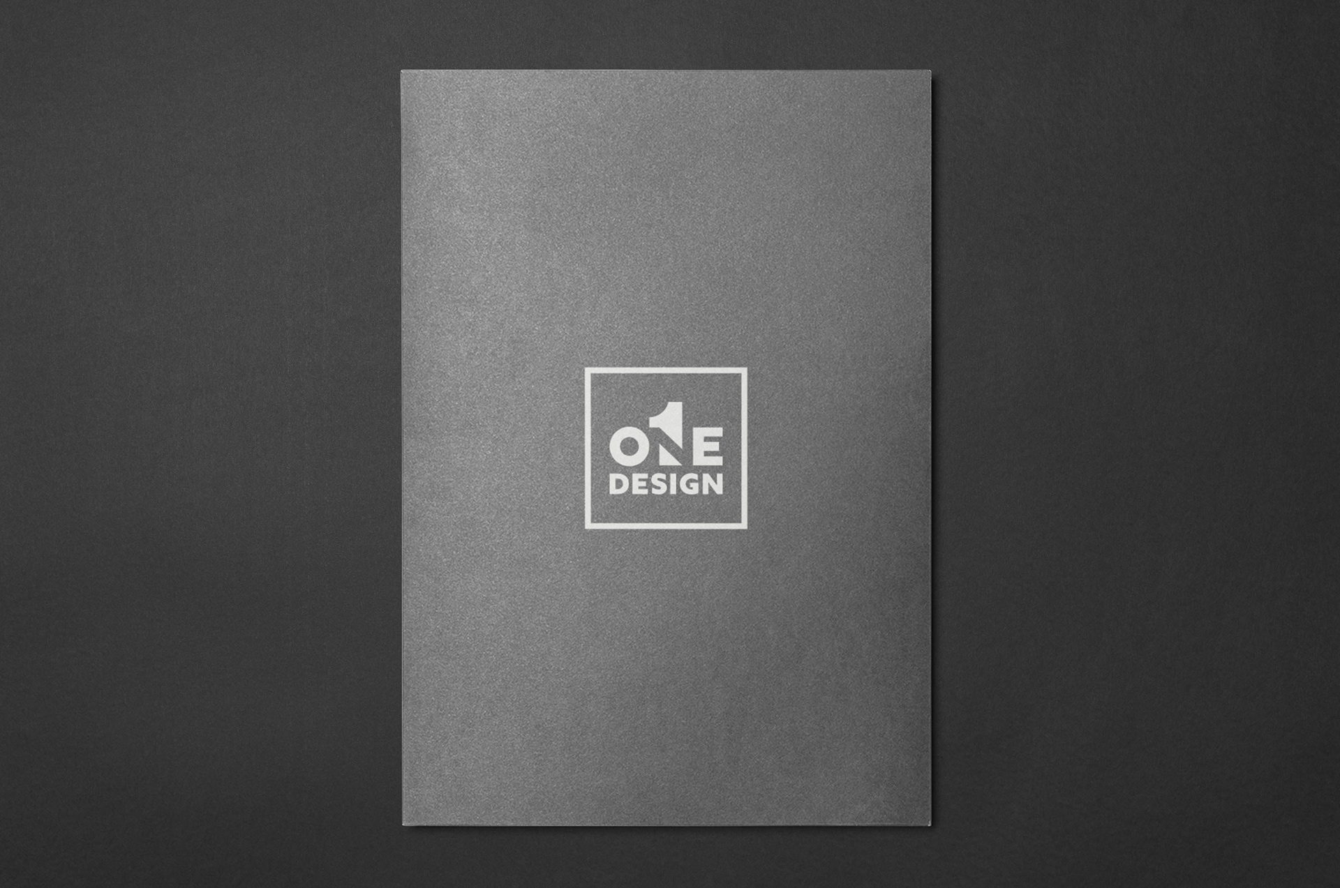
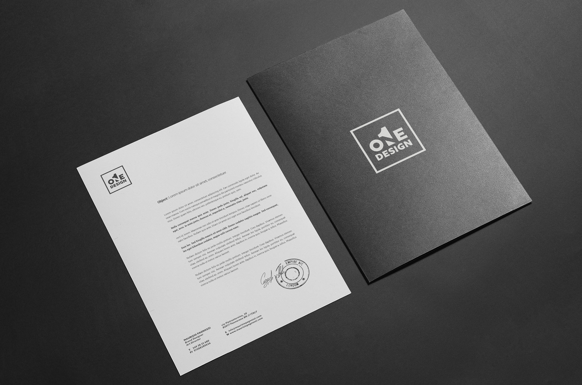
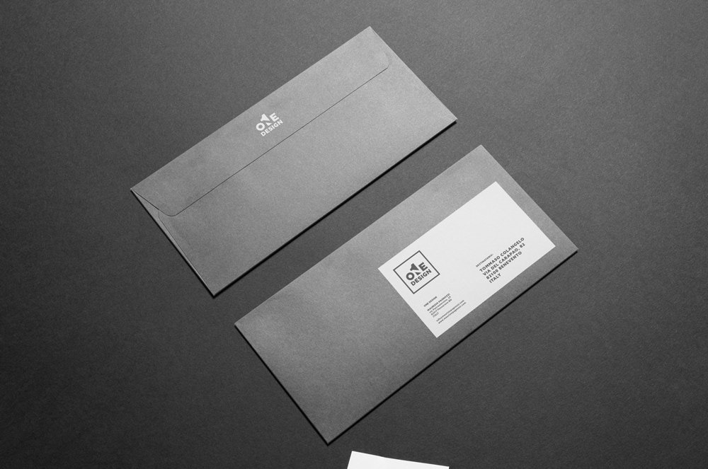
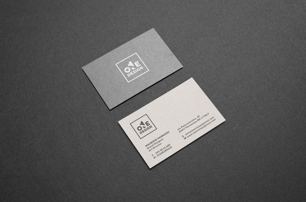
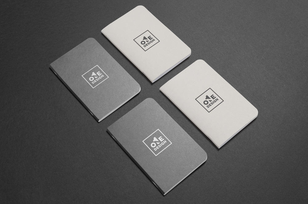
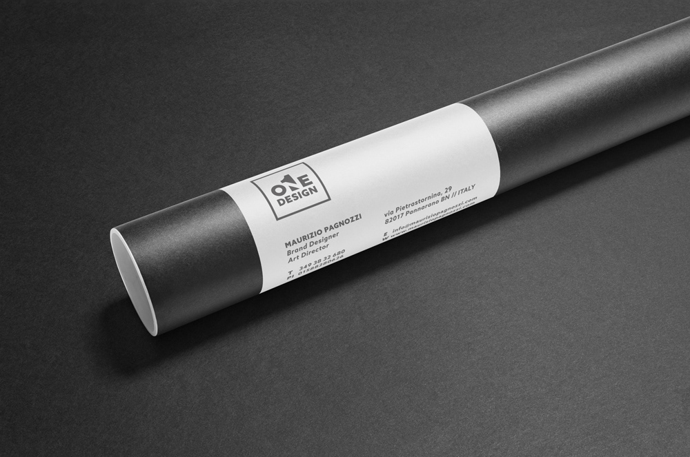
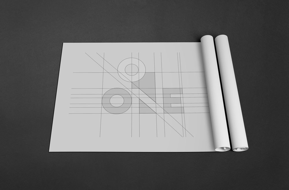
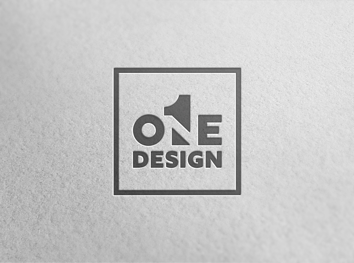
For One Design, the mark comes from the idea of synthesis: a logo able to express approach, vision, and precision through an essential form. The project is based on Gestalt principles and the use of negative space, where perception completes meaning.
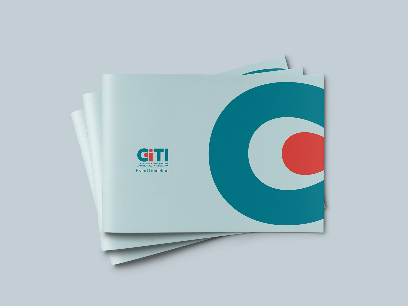
The symbol builds the concept of “One” through the balance between solid and empty spaces, applying the figure-ground principle: what is visible and what is implied coexist within the same mark, making the logo immediate yet layered.
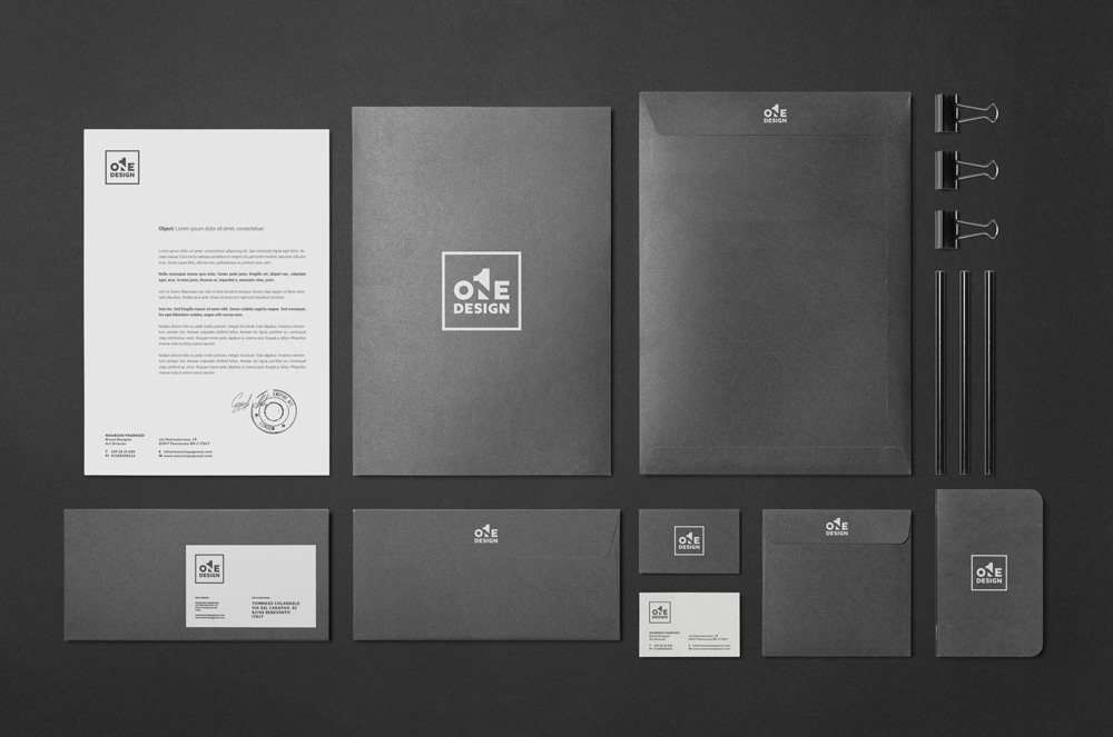
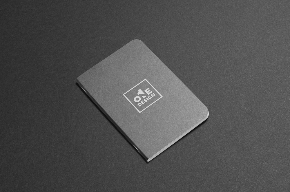
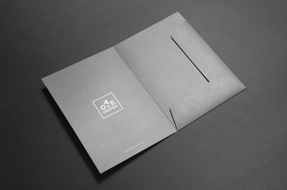
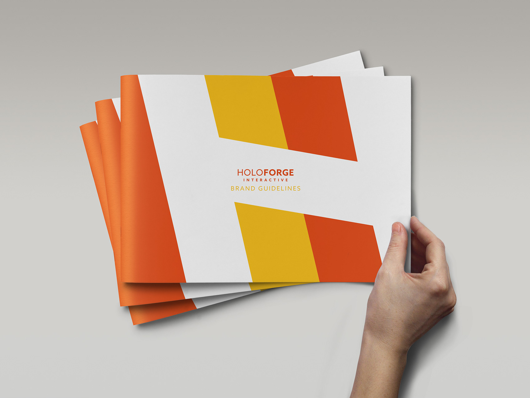
Minimalism and structure become the language, transforming the studio identity into a visual system that is clear, distinctive, and built to last.
Un’identità personale non è solo una firma visiva, ma una dichiarazione di metodo.
Per One Design, il segno nasce dall’idea di sintesi: un logo capace di raccontare approccio, visione e precisione in una forma essenziale. Il progetto si basa sui principi della Gestalt e sull’uso dello spazio negativo, dove la percezione completa il significato.
Il simbolo costruisce il concetto di “One” attraverso l’equilibrio tra pieni e vuoti, applicando il principio di figura-sfondo: ciò che si vede e ciò che si intuisce convivono nello stesso segno, rendendo il logo immediato ma stratificato.
Minimalismo e struttura diventano così linguaggio, trasformando l’identità dello studio in un sistema visivo chiaro, distintivo e costruito per durare.